Intro to Regression: Part 2: Simple linear regression, an example
Before we get into an abstract analysis of linear regression models, let's build some intuition by looking at a concrete example. All examples in this series are done using R.
Let's look at the mtcars dataset. The mtcars dataset contains performance characteristics for 32 different car models. Variables in the dataset include the cars' make and model, miles-per-gallon (mpg), weight (wt), horsepower (hp), number of cylinders (cyl), transmission type (manual vs. automatic), and a few others.
data(mtcars)
mtcars

##                      mpg cyl  disp  hp drat    wt  qsec vs am gear carb
## Mazda RX4           21.0   6 160.0 110 3.90 2.620 16.46  0  1    4    4
## Mazda RX4 Wag       21.0   6 160.0 110 3.90 2.875 17.02  0  1    4    4
## Datsun 710          22.8   4 108.0  93 3.85 2.320 18.61  1  1    4    1
## Hornet 4 Drive      21.4   6 258.0 110 3.08 3.215 19.44  1  0    3    1
## Hornet Sportabout   18.7   8 360.0 175 3.15 3.440 17.02  0  0    3    2
## Valiant             18.1   6 225.0 105 2.76 3.460 20.22  1  0    3    1
## ...
Building a regression model that predicts mpg
For this example, we'd like to use the data to build a regression model that can predict mpg using one (or more) of the other variables.
The response variable is mpg. Let's keep things simple and select just a single predictor variable: weight (wt). To visualize the relationship between the two variables, we'll plot them against each other in a scatterplot:
library(ggplot2)
library(grid)
qplot(x=wt, y=mpg, data=mtcars) +
    ggtitle("mpg vs. weight") +
    xlab("weight (x 1000 lbs)")
There's a clear negative correlation between mpg and weight. As the weight variable increases (along the x-axis), the mpg variable decreases (along the y-axis). This follows intuitively, since we should expect heavier cars to have lower mpg.
Linear regression is all about fitting a line to the data, like so:
qplot(x=wt, y=mpg, data=mtcars) +
    ggtitle("mpg vs. weight") +
    xlab("weight (x 1000 lbs)") +
    stat_smooth(method="lm", se=FALSE, size=1)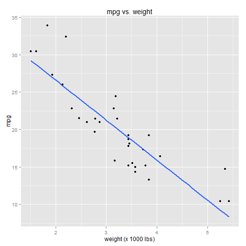
Notice that some data points fall precisely on the line while others do not. The line is selected in a way that minimizes the total distance between the line and all data points.
A closer look at the linear regression model
As we all know from basic geometry, a line has the formula: Y = b + mX.
- Y is the dependent variable
- X is the independent variable
- b is the Y-intercept (the value of Y when X=0)
- m is the slope (change-in-Y per change-in-X)
- Y is the response variable (mpg)
- X is the predictor variable (wt)
- \(\beta_0\) is the Y-intercept (the value of mpg when wt=0)
- \(\beta_1\) is the slope (change-in-mpg per change-in-wt)
- \(\epsilon\) is the error term (aka the "residuals")
The error term accounts for the difference between the predicted value of Y (mpg), as predicted by the linear model, and the actual value of Y. These "prediction errors" (aka "residuals") are illustrated using the red lines in the chart below:
model <- lm(mpg ~ wt, data=mtcars)
mpg.predicted <- predict(model)

qplot(x=wt, y=mpg, data=mtcars) +
    ggtitle("mpg vs. weight") +
    xlab("weight (x 1000 lbs)") +
    stat_smooth(method="lm", se=FALSE, size=1) +
    geom_line(aes(x=c(mtcars$wt, mtcars$wt),
                  y=c(mtcars$mpg,mpg.predicted),
                  group=rep(seq_along(mtcars$wt),2)),
              color="red",
              linetype="dotted",
              arrow=arrow(ends="both",type="closed",length=unit(3,"points")))
Analogy to mean and variance
In a sense, this is analagous to mean and variance. You'd rarely think of it this way, but one could say that a variable's mean is selected in a way that minimizes the total distance between the mean and all data points. This is done by minimizing the squared differences between the mean and the actual values -- in other words, by minimizing the variance.
B0 <- mean(mtcars$mpg)

qplot(x=wt, y=mpg, data=mtcars) +
    ggtitle("mpg") +
    xlab("") +
    geom_hline(y=B0, colour="blue", linetype="dashed", size=1) +
    geom_line(aes(x=c(mtcars$wt, mtcars$wt),
                  y=c(mtcars$mpg, rep(B0,length(mtcars$mpg))),
                  group=rep(seq_along(mtcars$wt),2)),
              color="red",
              linetype="dotted",
              arrow=arrow(ends="both",type="closed",length=unit(3,"points")))
"The variance explained by the model..."
Combining the two charts:
qplot(x=wt, y=mpg, data=mtcars) +
    ggtitle("mpg vs. weight") +
    xlab("weight (x 1000 lbs)") +
    stat_smooth(method="lm", se=FALSE, size=1) +
    geom_hline(y=B0, colour="red", linetype="dashed", size=1) +
    geom_line(aes(x=c(mtcars$wt, mtcars$wt),
                  y=c(mtcars$mpg, rep(B0,length(mtcars$mpg))),
                  group=rep(seq_along(mtcars$wt),2)),
              color="red",
              linetype="dotted",
              arrow=arrow(ends="both",type="closed",length=unit(3,"points"))) +
    geom_line(aes(x=c(mtcars$wt, mtcars$wt),
                  y=c(mtcars$mpg,mpg.predicted),
                  group=rep(seq_along(mtcars$wt),2)),
              color="blue",
              linetype="dotted",
              arrow=arrow(ends="both",type="closed",length=unit(3,"points")))
I changed some of the colors, so just to be clear:
- The red line is the mean mpg (technically speaking, a linear regression model with no predictor variables)
- The red dotted lines are the "errors" between the mean and the actual data
- The blue line is the linear model with weight as a predictor variable
- The blue dotted lines are the errors associated with the linear model
Note that some of the blue dotted lines overlap the red dotted lines.
One way to think about this chart, conceptually:
- The red dotted lines represent the variance of the mpg variable alone
- The blue dotted lines represent the variance of mpg after applying the linear regression model
Note that the total variance represented by the blue dotted lines is less than the total variance represented by the red dotted lines. This is a little easier to see when the two models are charted side by side:


Regression models, in a sense, try to "explain the variance" observed in the response variable, by correlating its variance with the variance of other variables. You will often hear phrases like, "the variance explained by the model ..." These charts basically illustrate what that means.
The linear regression model will never be perfectly accurate with its predictions; there will always be some error. But the idea is that the model does a better job predicting the response variable than, say, the mean of the response variable alone. This "better job" is evidenced by the smaller variance in the model.
We'll eventually get into the finer details of all this, but right now we're just trying to build some intuition, so you have a better feel for what this regression stuff is and what it means.